Summary
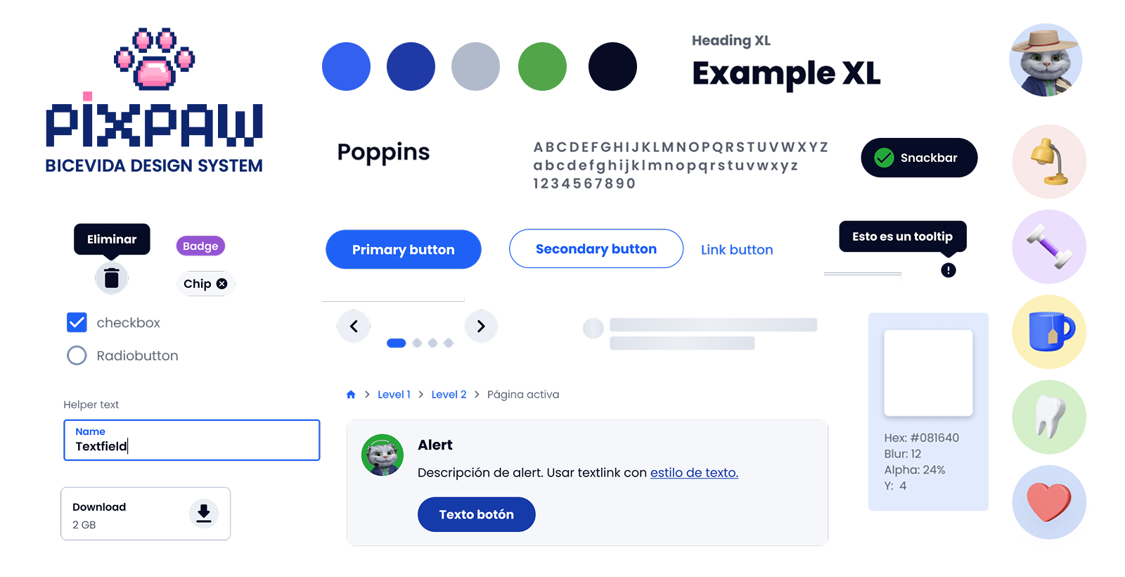
BICE Vida is the life insurance arm of Grupo BICE. Over four years I led the evolution of its Design System, aiming to build a solid, scalable, and coherent foundation that would deliver consistent experiences across all of the company's digital products.
The challenge
The company had multiple growing digital products, each with its own needs and teams working independently. This created visual inconsistencies, duplicated effort, and hard-to-maintain components.
Inconsistency
Visual and interaction differences between products that affected the user experience.
Scalability
Lack of a solid foundation of components and tokens to scale new products efficiently.
Collaboration
Poorly defined processes and tools between Design and Development that caused rework and dependencies.
My role
I led the UI design team (3 designers) and the Design Systems area within the company, working closely with Development, Product, and business leaders to align the vision, define standards, and ensure adoption of the system.
Strategy
Defining the Design System roadmap aligned with business objectives each quarter.
Design
Creating and evolving components, patterns, tokens, and usage guidelines.
Collaboration
Facilitating collaboration between Design, Development, and Product.
Adoption
Driving adoption of the system through documentation, training, and support.
Process
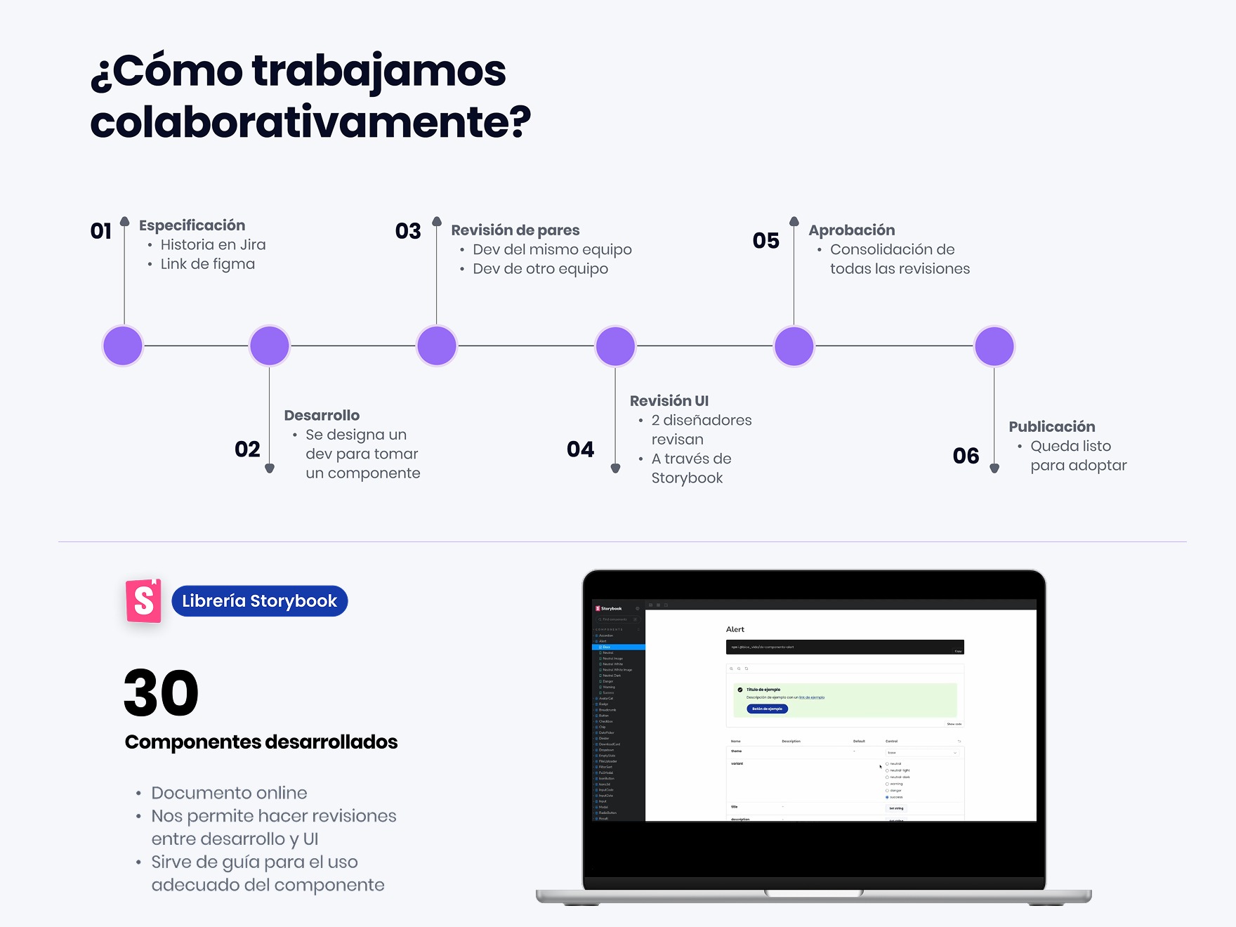
We worked iteratively in two-week sprints alongside design and development. Each sprint included developers from every cell building 1 to 2 components.
Research
Audit of existing products, needs analysis, and benchmarking.
Foundations
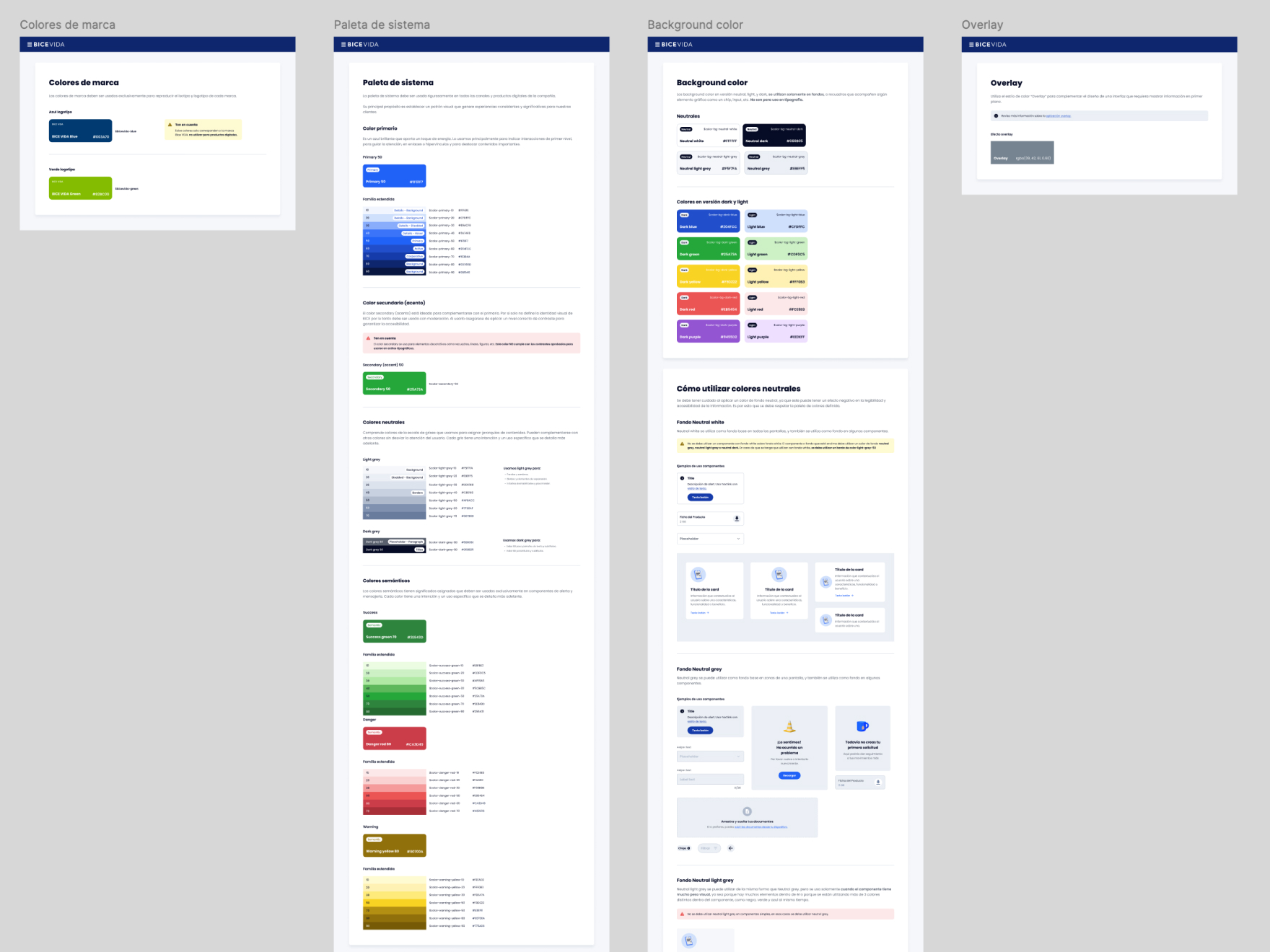
Defining principles, design tokens, and visual language.
Components
Designing and building reusable, accessible, and scalable components.
Documentation
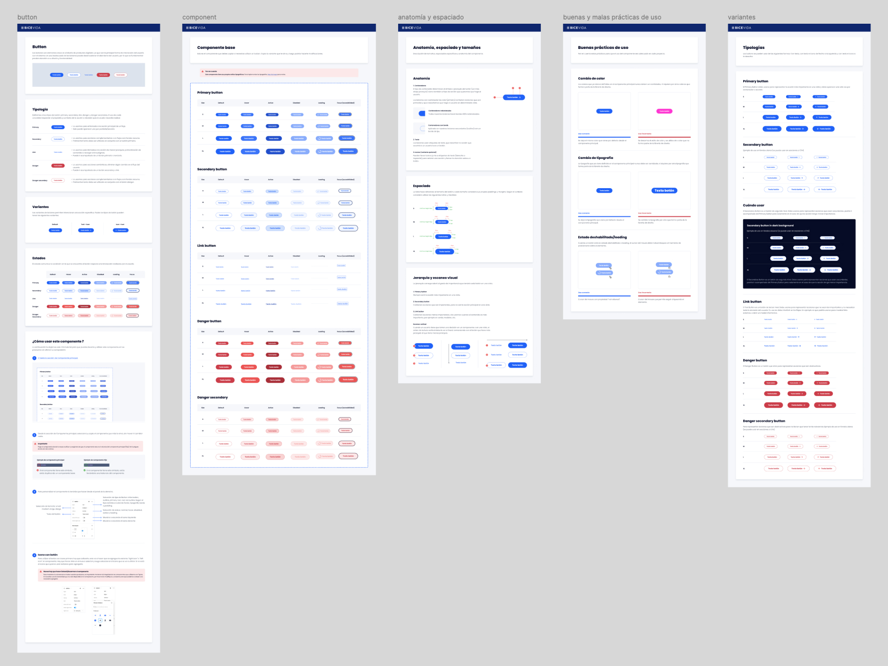
Creating guides, usage examples, and best practices in Storybook.
Adoption and improvement
Supporting teams, gathering continuous feedback, and evolving the system.
Solution
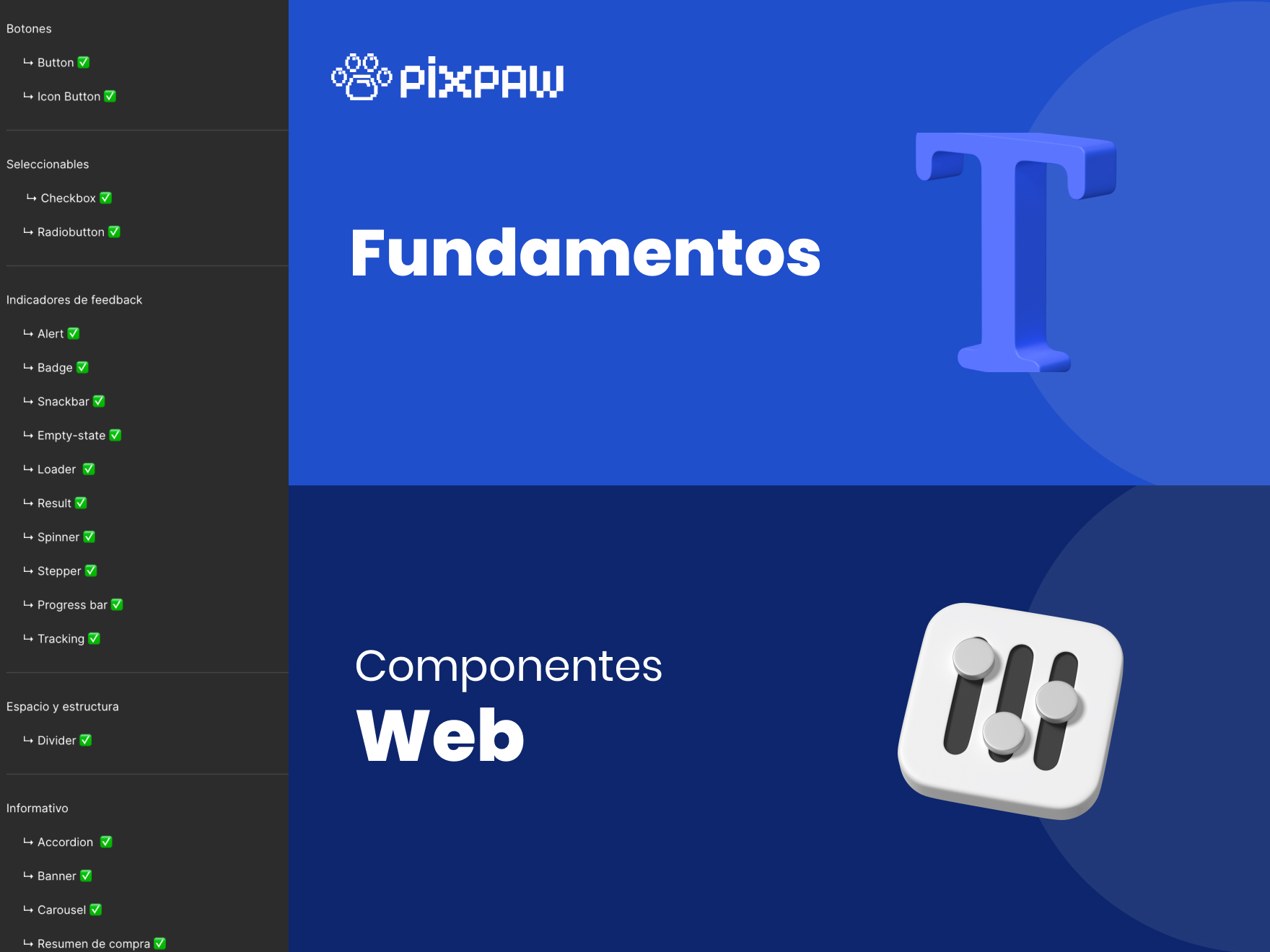
We built a Design System with 60 reusable, scalable components that was adopted by all existing cells (roughly 6).
Impact
+40%
Reduction in design and development time
+80%
Component reuse across new products
+90%
Design System adoption across teams
Better
More consistent and accessible experience for users
More projects
View all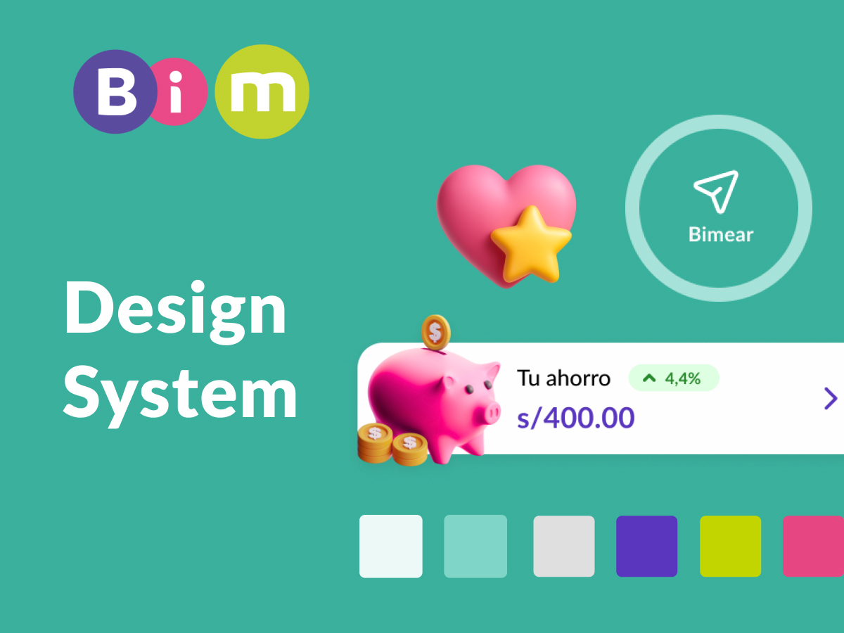
Design System · Mobile
BIM
I designed the mobile app's design system and established the shared visual foundations used by several Product Designers.
View project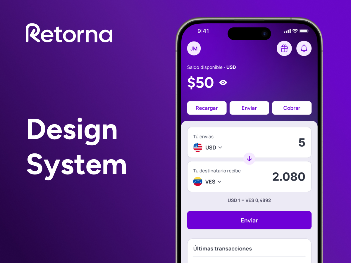
Design System · DesignOps
Retorna
I built the foundations of the design system, DesignOps processes, and new ways of collaborating between Product, Development, and Growth.
View project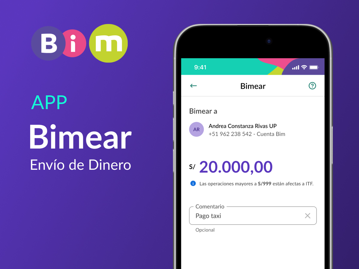
Product Design
Money Transfer · BIM App
Money transfer flow for the BIM app, from wireframes to high-fidelity design alongside the Design System.
View project